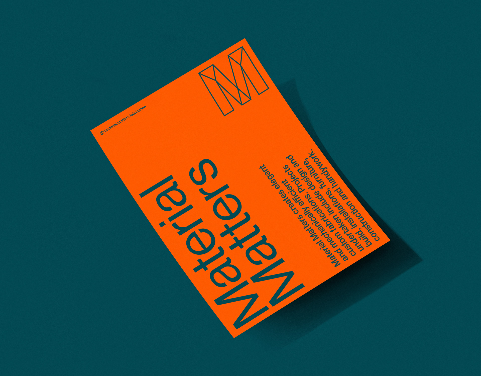
A bold and structured identity for Material Matters, the Leeds based creator of elegant and mechanically efficient custom fabrications, installations and furniture.
A Strong Foundation
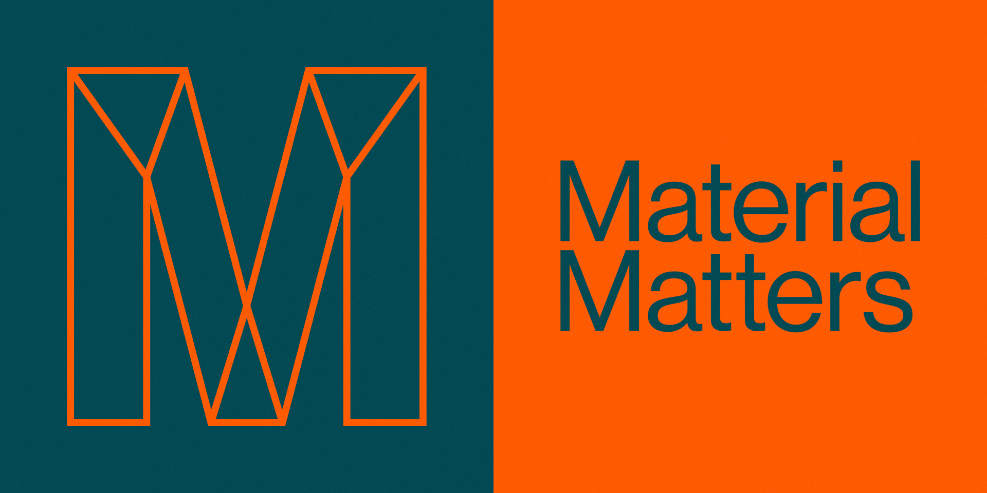
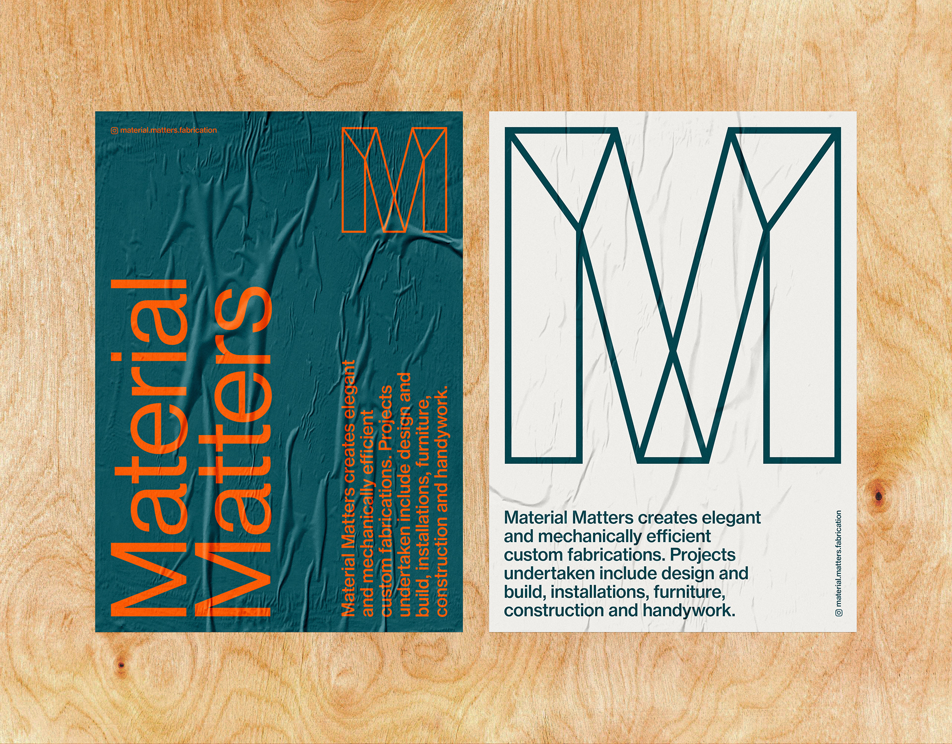
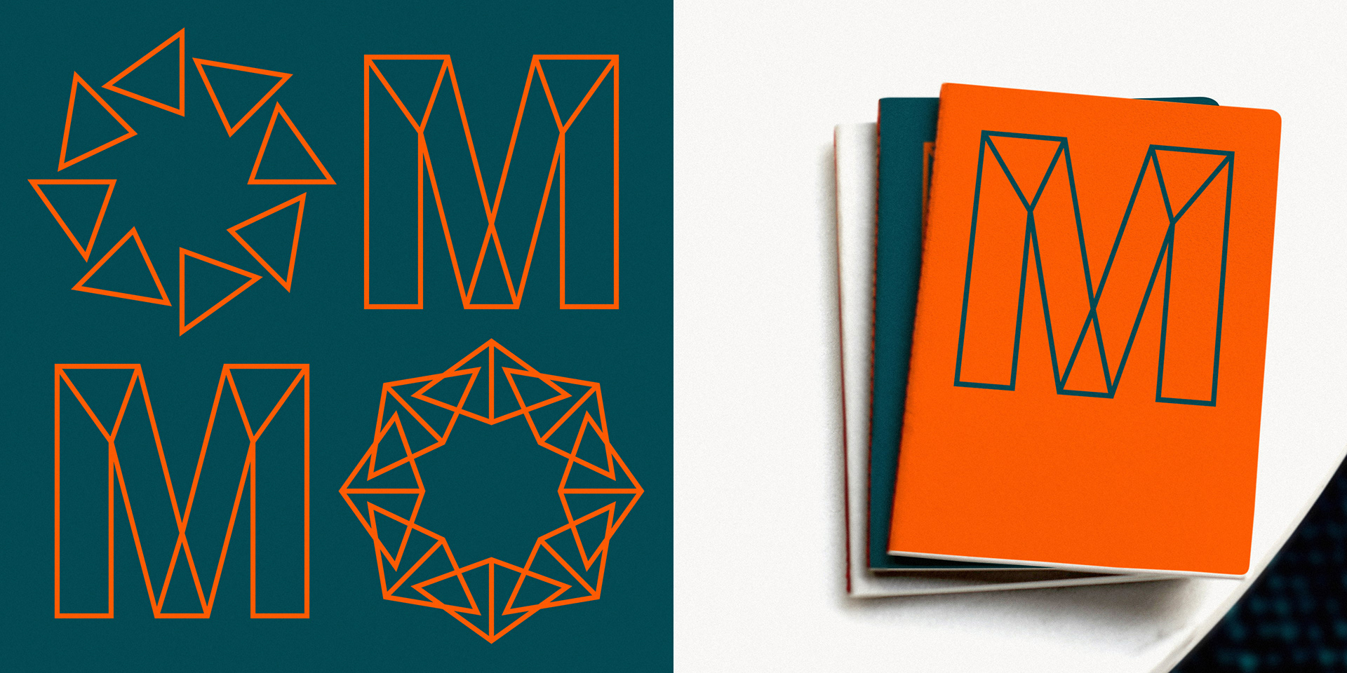
The graphic letter M logo forms the foundation of the identity and is designed to have a clean and bold precense, engineered with strength and clarity of purpose.
The graphic letter M logo forms the foundation of the identity and is designed to have a clean and bold precense, engineered with strength and clarity of purpose.
No-Nonsense
The logo is designed to be recognisable in isolation but also to offer a flexibility of use across applications. The typographic approach is direct and no-nonsense, designed to reflect the experience and knowledge of Material Matters within the industry.
The logo is designed to be recognisable in isolation but also to offer a flexibility of use across applications. The typographic approach is direct and no-nonsense, designed to reflect the experience and knowledge of Material Matters within the industry.
Mechanical Quality
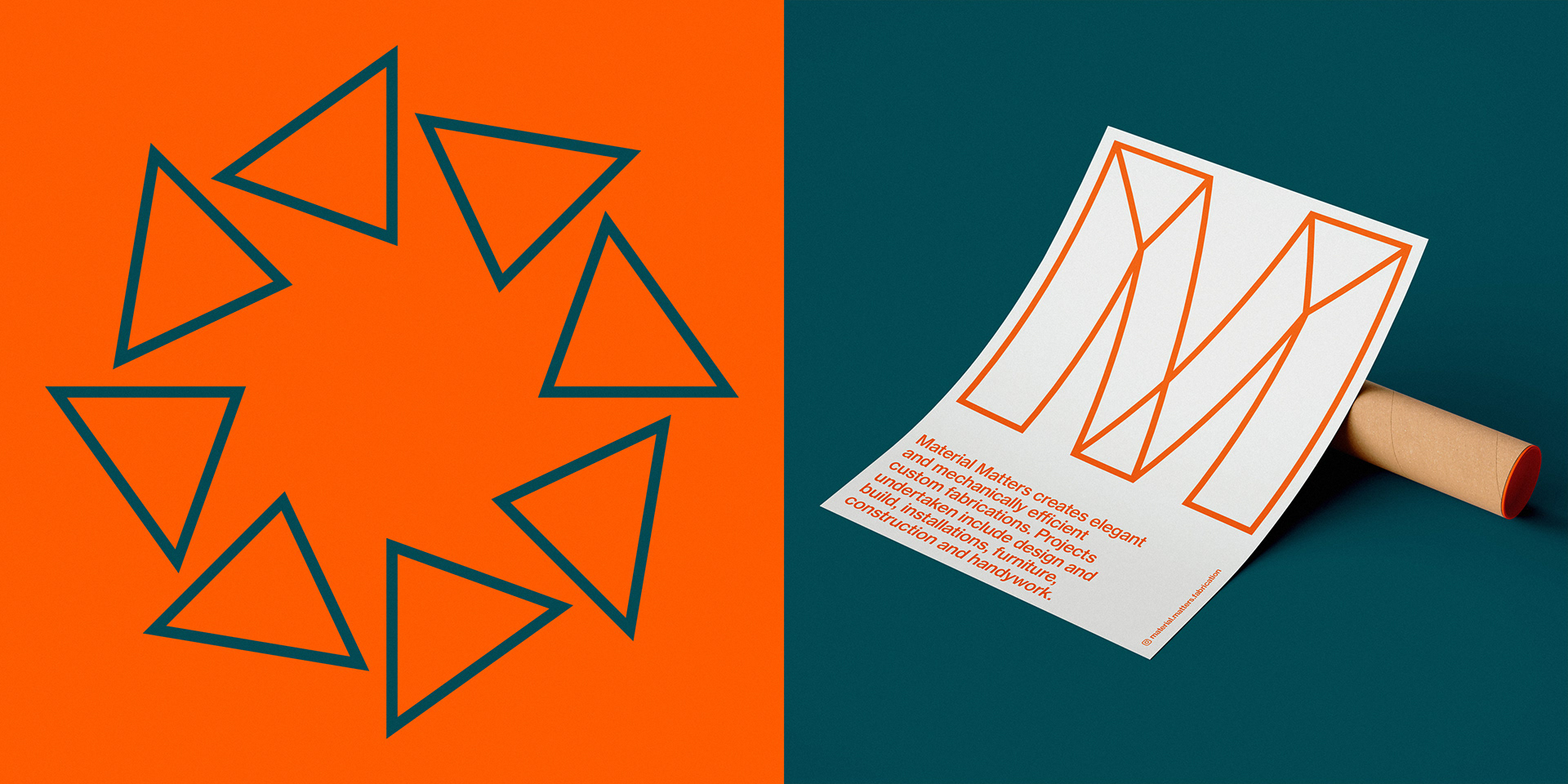
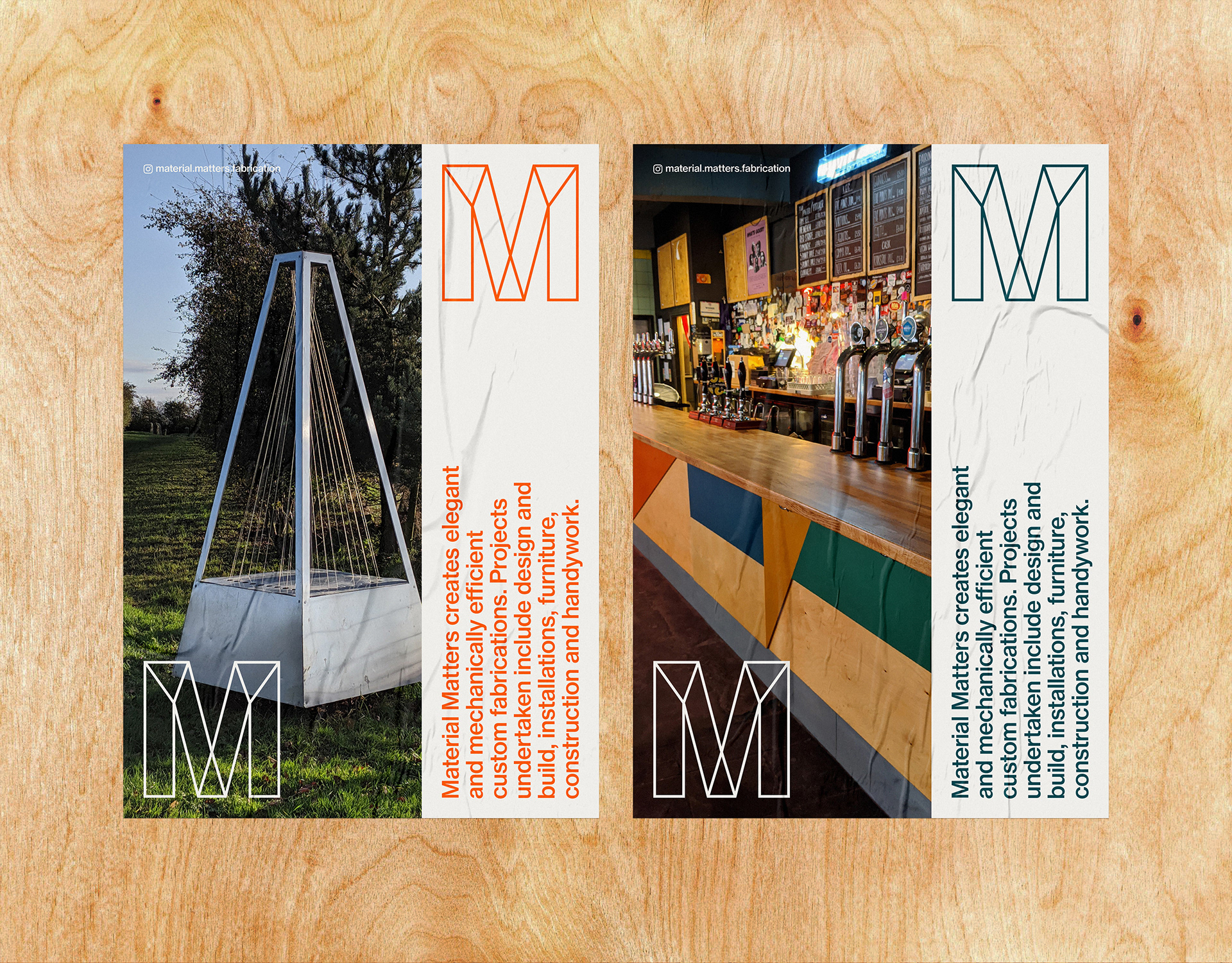
The additional graphics are constructed by combining the shapes found within the logo in a variety ways. The unique forms created are designed to have a mechanical quality whilst suggesting the bespoke nature of the work undertaken by Material Matters.
The additional graphics are constructed by combining the shapes found within the logo in a variety ways. The unique forms created are designed to have a mechanical quality whilst suggesting the bespoke nature of the work undertaken by Material Matters.
Info
Photography courtesy of Material Matters
Photography courtesy of Material Matters