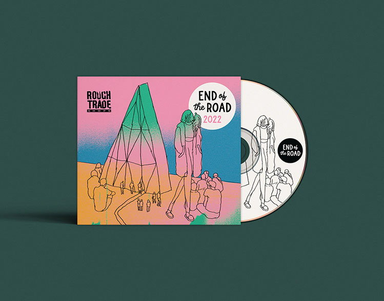
New identity and visual direction for End of the Road, the critically acclaimed festival held annually in the beautiful surroundings of Larmer Tree Gardens in Dorset.
Typographic Direction
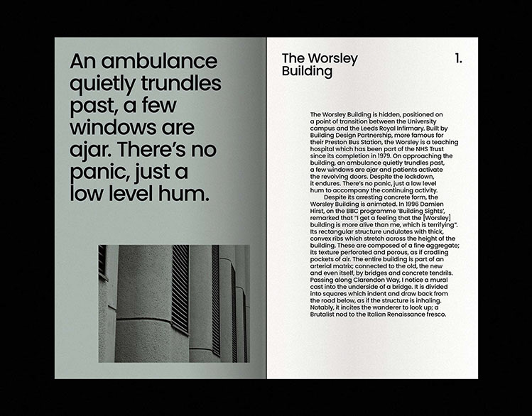
The new direction is designed to embody the spirit and values of the "UK's most exciting and diverse medium-sized festival" (The Guardian). The project aims to strike a balance between being playfully welcoming and having hidden depths to explore – retaining a sense of mystery and discovery.
Fun and Functional
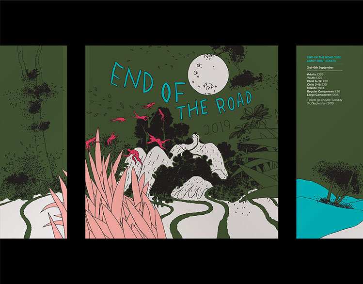
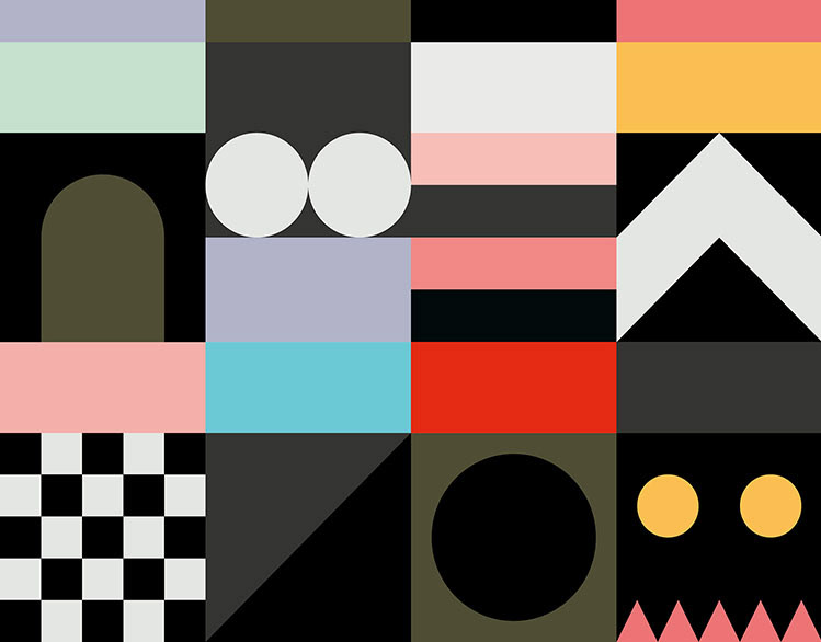
One of the key objectives of the project is to provide End of the Road with a fun but functional, own-able graphic language. This is acheived by creating a typographic platform for the festival's illustration to interact with, bringing together various visual elements into a versatile and cohesive whole. All source illustration is supplied by the incredible artist KW and is then remixed by Process Play adding colour, texture and typography.
One of the key objectives of the project is to provide End of the Road with a fun but functional, own-able graphic language. This is acheived by creating a typographic platform for the festival's illustration to interact with, bringing together various visual elements into a versatile and cohesive whole. All source illustration is supplied by the incredible artist KW and is then remixed by Process Play adding colour, texture and typography.
The Festival Experience
End of the Road is known for its diverse offering: including live music, art, literature, cinema, workshops, comedy and much more. As such the festival represents many things to many people. The new identity and visual direction aims to reflect this diversity by seeing the festival experience as one complete entity, rather than restricting it to any one specific genre of music.
End of the Road is known for its diverse offering: including live music, art, literature, cinema, workshops, comedy and much more. As such the festival represents many things to many people. The new identity and visual direction aims to reflect this diversity by seeing the festival experience as one complete entity, rather than restricting it to any one specific genre of music.
Colour System
A palette of warm, earthy, woodland colours combine with a selection of vibrant, brighter tones. The colour system is joyful and curious with a nod to mid-century bookishness.
A palette of warm, earthy, woodland colours combine with a selection of vibrant, brighter tones. The colour system is joyful and curious with a nod to mid-century bookishness.
A State of Motion
The typographic direction, in combination with how the illustration is utilised, is intended to have a cinematic quality. Playing with scale and abstraction adds pace and intrigue, setting the visual narrative in a state of constant motion.
The typographic direction, in combination with how the illustration is utilised, is intended to have a cinematic quality. Playing with scale and abstraction adds pace and intrigue, setting the visual narrative in a state of constant motion.
Info
Design: Process Play
Illustration: KW x Process Play
Design: Process Play
Illustration: KW x Process Play
