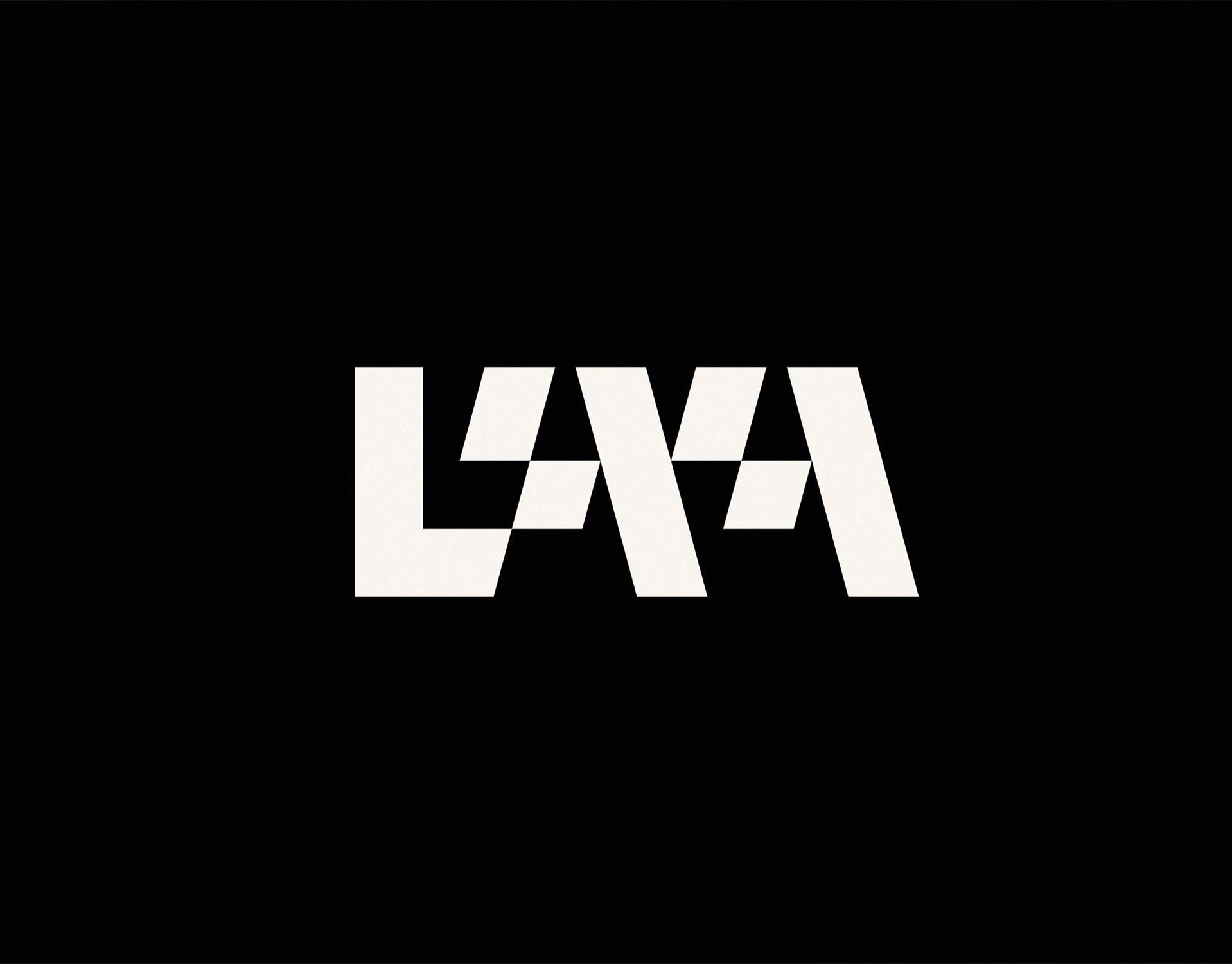
A structured, typographic brand identity and graphic language for Leeds Society of Architects – the city's branch of the Royal Institute of British Architects (RIBA).
Collaborative Thought
Leeds Society of Architects (LSA) exists to celebrate the architecture and architects of Leeds, encouraging collaborative thought on the ever-changing issues that face the industry. LSA required a new, unique brand identity developing to better reflect the exciting and forward-thinking work that they are doing within the built environment community.
Leeds Society of Architects (LSA) exists to celebrate the architecture and architects of Leeds, encouraging collaborative thought on the ever-changing issues that face the industry. LSA required a new, unique brand identity developing to better reflect the exciting and forward-thinking work that they are doing within the built environment community.
LSA Projects
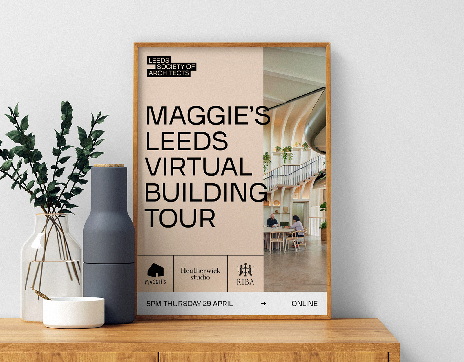
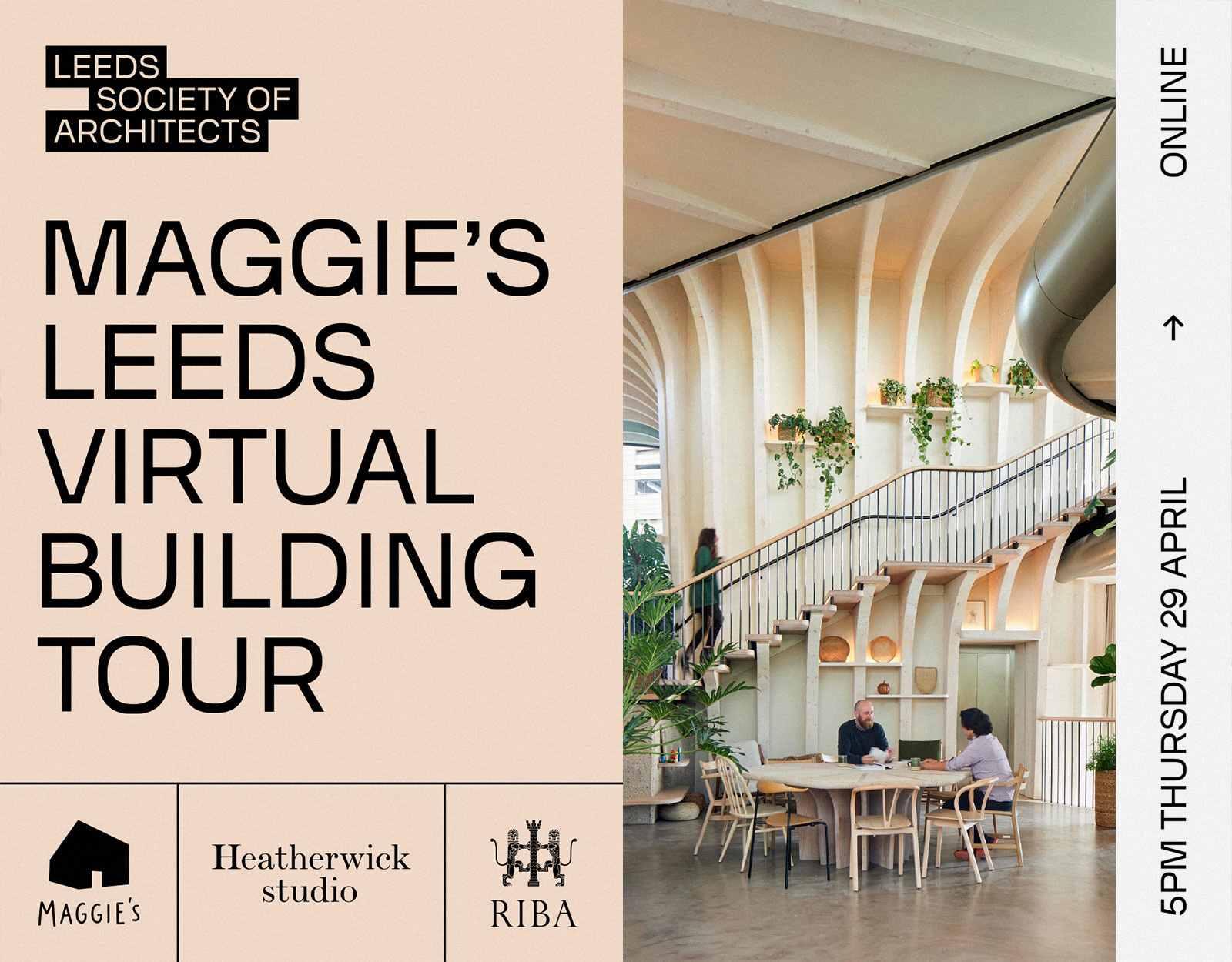
LSA projects include talks, building tours, exhibitions, dinners, competitions, workshops and online events such as the recent hosting of a virtual building tour of Maggie's Leeds with it's creator, Heatherwick Studio.
LSA projects include talks, building tours, exhibitions, dinners, competitions, workshops and online events such as the recent hosting of a virtual building tour of Maggie's Leeds with it's creator, Heatherwick Studio.
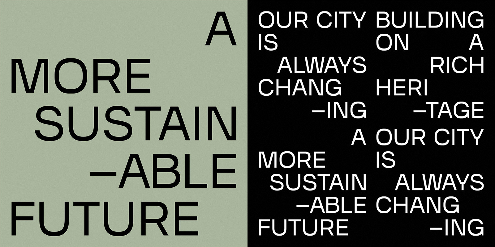
Architectural Rhythms
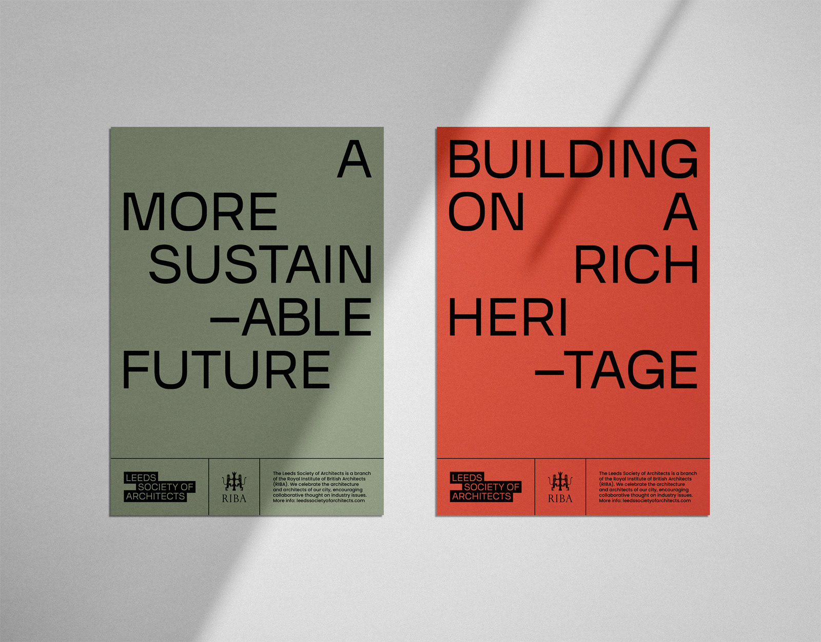
The graphic language of the new identity is designed to express the architectural rhythms of the city – typographically exploring space as a way of visually echoing the city's most interesting examples of architecture.
The graphic language of the new identity is designed to express the architectural rhythms of the city – typographically exploring space as a way of visually echoing the city's most interesting examples of architecture.
An Element of Neutrality
Although modern and expressive, it was felt that the new identity needed to retain an element of neutrality to help reflect the diversity of LSA's work. LSA brings together people from many different areas of architecture, not just one specific style or era. The typographic approach, pared-back colour system, strong underlying grid and considered use of space all help to visually communicate this line of thinking.
Although modern and expressive, it was felt that the new identity needed to retain an element of neutrality to help reflect the diversity of LSA's work. LSA brings together people from many different areas of architecture, not just one specific style or era. The typographic approach, pared-back colour system, strong underlying grid and considered use of space all help to visually communicate this line of thinking.
Building, Growing and Changing
The offset architectural blocks of the new logo and typographic approach are suggestive of progress and movement. The forms are structured but not static – giving the impression of building, growing and changing. The approach is inspired by the idea of balancing formality and informality – a strong underlying structure meets a more human, organic flow.
The offset architectural blocks of the new logo and typographic approach are suggestive of progress and movement. The forms are structured but not static – giving the impression of building, growing and changing. The approach is inspired by the idea of balancing formality and informality – a strong underlying structure meets a more human, organic flow.
People Focussed
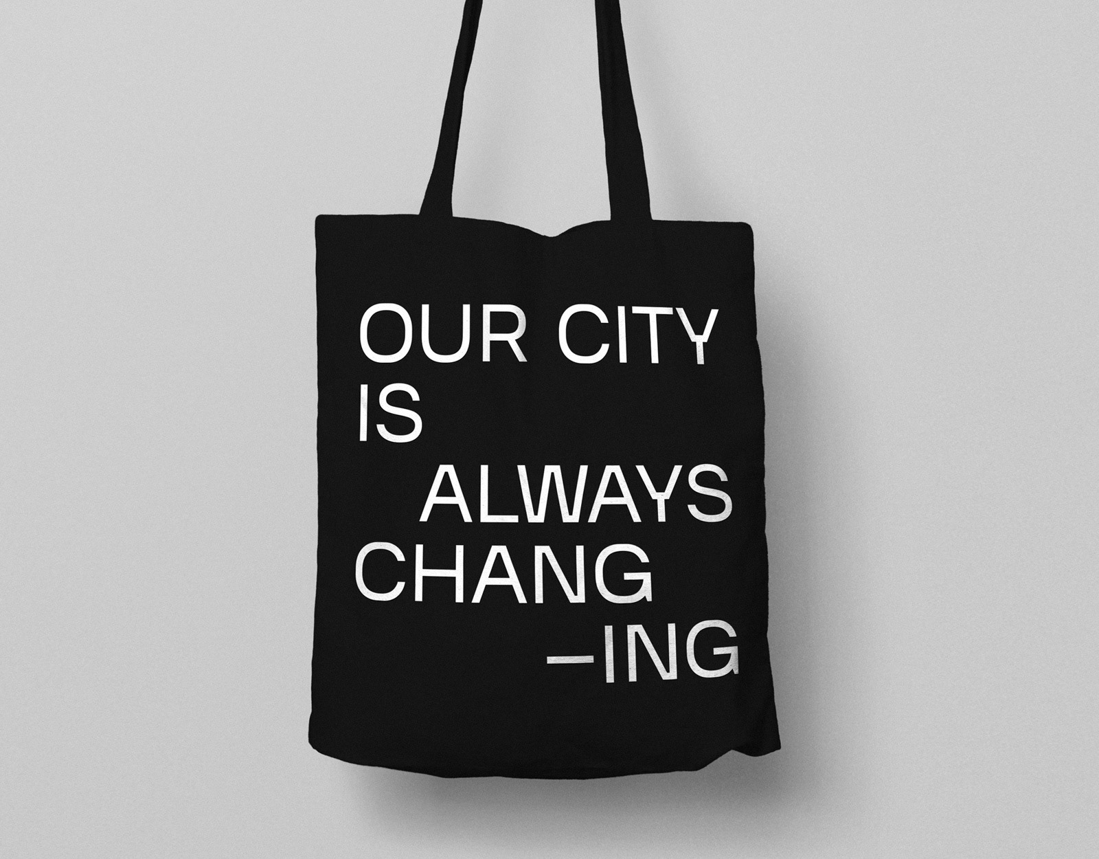
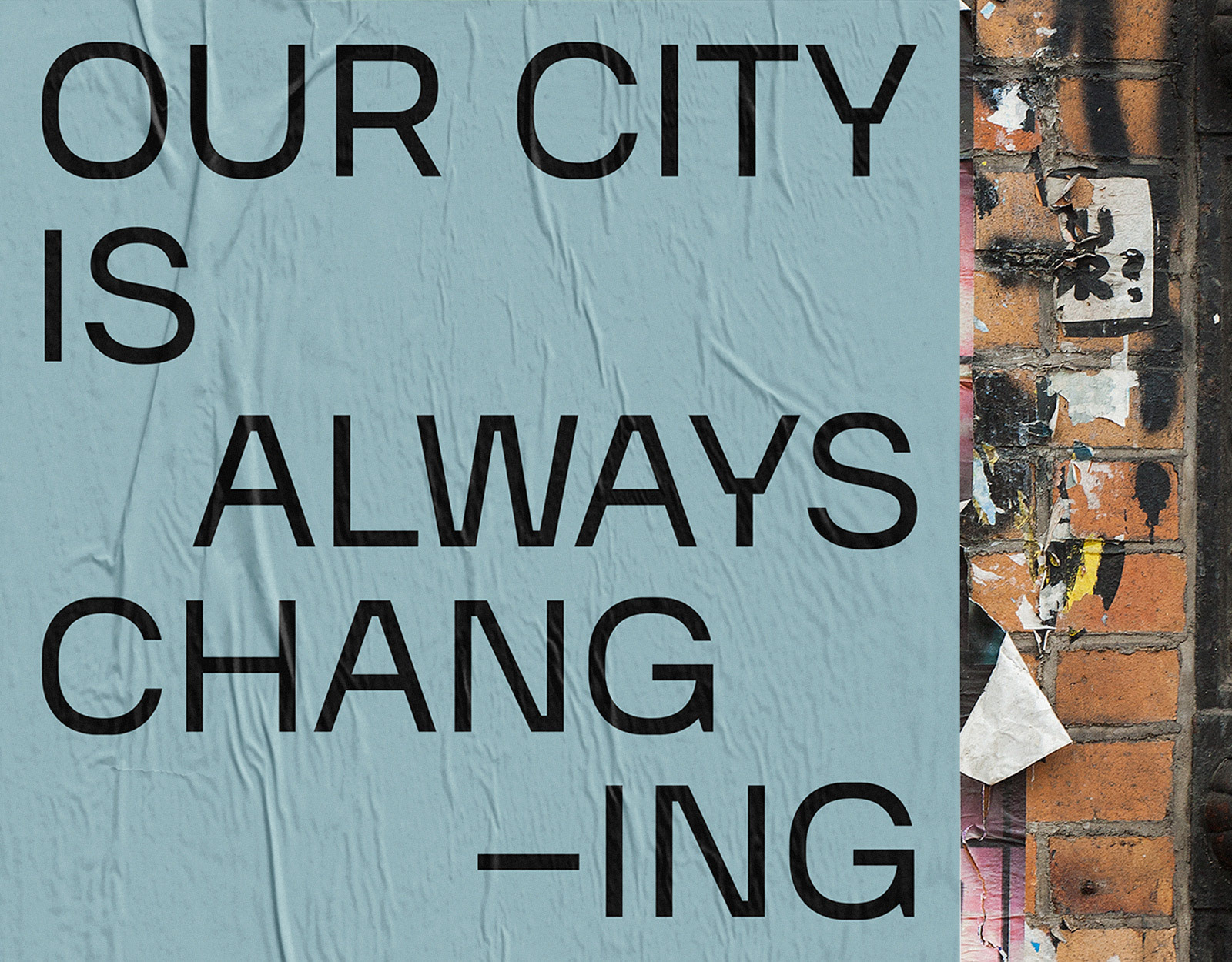
The wording used throughout the new identity is intended to be simple, engaging, accessible and an expression of pride in the architects and architecture of Leeds. The general messaging combined with a focus on the small details, for example using ‘our’ instead of 'the' city, all help to communicate LSA's positivity and values as an organisation.
The wording used throughout the new identity is intended to be simple, engaging, accessible and an expression of pride in the architects and architecture of Leeds. The general messaging combined with a focus on the small details, for example using ‘our’ instead of 'the' city, all help to communicate LSA's positivity and values as an organisation.
Testimonial by Ben Pipkin
Leeds Society of Architects Co-President
"Working with Process Play was a positive and productive experience from start to finish. By taking the time to understand the core values of the organisation and those we represent, the studio was able to give us a new holistic identity that is clear, confident and engaging. A personal and professional service, highly recommended."
Info
Visit Leeds Society of Architects for more info on all their current projects and events. Maggie's Leeds photography courtesy of Hufton + Crow / Heatherwick Studio. Violet Sans font courtesy of Violet Office. Leeds Society fo Architects is a branch of the Royal Institute of British Architects (RIBA).
Visit Leeds Society of Architects for more info on all their current projects and events. Maggie's Leeds photography courtesy of Hufton + Crow / Heatherwick Studio. Violet Sans font courtesy of Violet Office. Leeds Society fo Architects is a branch of the Royal Institute of British Architects (RIBA).